Good composition is key in order to make a beautiful image and there are many different composition techniques that can help us create balance and harmony. The golden triangle in photography is one technique you can use to elevate your compositions. In this post we'll look at what it is and how you can use it to improve your food photos.
Composition grids are guides, not rules
Before we start I want to point out that composition grids like the one we're going to talk about here are not hard and fast rules and do not need to be followed religiously in order to create outstanding art!
There are no right or wrong answers when it comes to photography and tools like these should be used as guides to help you. If you're new to food photography they can be an excellent way to learn what makes a visually pleasing image and should assist your decision making, not dictate it.
After a while you'll start to incorporate these composition techniques automatically and you'll begin to feel when your scene is "right" for you. That being said, no-one is ever too professional to use them, so never feel embarrassed to use them in your own work or when working with clients! I still love to use specific composition grids like the golden triangle to refine my frames, particularly when doing client work to make sure I'm creating the best quality work that I can.
What is the golden triangle in photography?
The golden triangle in photography terms is a composition technique where a single line is drawn to connect opposite corners of the frame, plus two additional lines which start at the remaining two corners and meet the long diagonal line at 90° angles. These lines divide the frame into four triangles and adjusts to fit any aspect ratio (rectangles or squares or any size). Here is an image to demonstrate what it looks like:
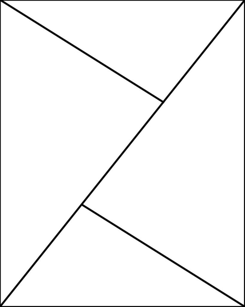
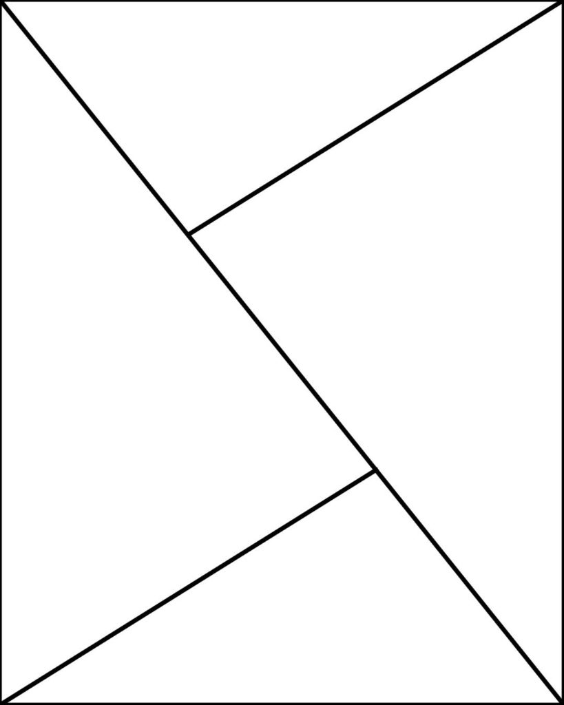
When placed into a square 1:1 ratio, all four lines intersect in the middle, creating four equal triangles.
The golden triangle composition is a great tool for creating balanced images and can be used as a guide to help you place elements in your frame. The positioning of your main subject and props will help the guide the viewer's eye around the image, finding the main subject whilst still taking in all the supporting elements and understand the overall story.
What Are You Waiting For? Let’s Improve Your Composition Skills!
My online food photography course for beginners has a whole module dedicated to composition theory!
How to use the golden triangle in food photography
There are a few different ways in which you can use the golden triangle in photography. Since this is a food photography blog, I'll use examples from my own food photography work, though the theory can be applied to other photography niches too.
Placing your hero
Your main subject is the "hero" of the shot and is where the audience's attention should ultimately land.
When using the golden triangle composition grid, you could place the hero on either of the line intersections, putting it slightly off-centre.
Alternatively, you could place the main subject in the centre of the frame, in-between the two intersections.
Below are two examples of how to put this into practice.
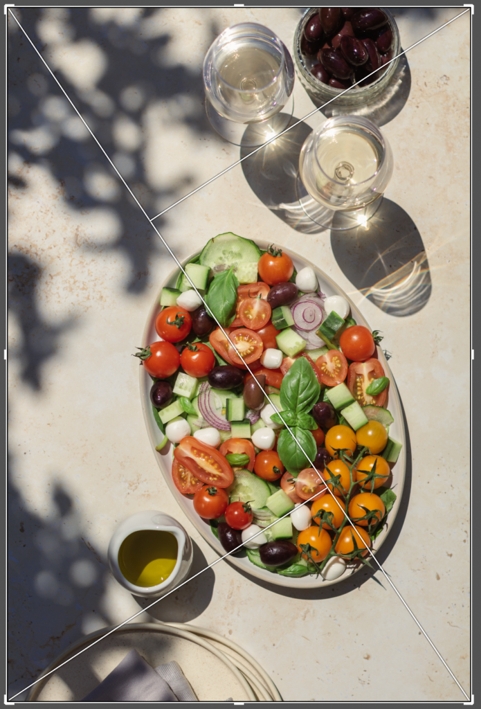
In the image on the left, the salad is placed over the intersection in the bottom of the frame. Since the plate is quite long, it's positioned diagonally more or less over the long line towards the upper intersection.
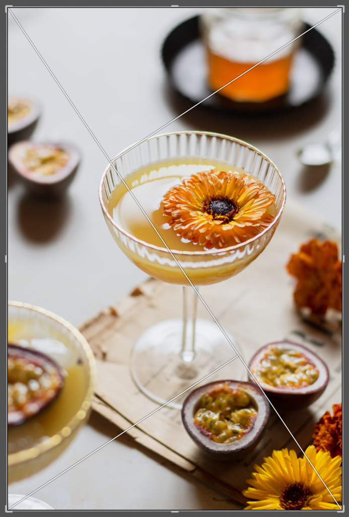
In the image on the right, the drink is placed in-between the two intersections, with the top rim of the glass touching the intersection and the base of the glass touching the lower intersection.
Positioning the props and supporting elements
Secondly, the golden triangle composition is very helpful to guide your placement of props and supporting elements in your frame.
You want these additional props to help with storytelling in the overall image, so choose items that made sense for your scene. They could be ingredients included in the main dish or drink, or things that would be present in the moment that is happening in the shot.
Furthermore, these props can also be used to lead the viewer's eye around the frame and towards your hero.
Learn the 7 simple steps for a successful photoshoot - every time
Using the previous images above, you can see that in the salad shot the plates in the bottom left are mostly out of the frame, but they come inside just enough to touch the lower line coming in from the bottom left corner. The little white jug is also positioned on the other side of the same line, just touching it and pointing towards the salad with the spout. These two props combined draw the audience into the image from the bottom and up towards the main plate.
As for the cocktail, all the additional props are placed on or around the lines that come in from the corners, effectively pulling the eye into the centre of the image where the glass stands.

Here is another example in landscape format. The wooden board is positioned at an angle, more or less along the long diagonal line and only as far as the left-side intersection. The melon halves are placed on the two intersections and one of them is being cut for extra interest. My hand holding the melon is aligned with the diagonal line and the other props (glasses, flowers and lime wedges in a bowl) are placed inside the triangles.
Creating negative space
Thirdly, you can use the golden triangle in photography to create negative space. This is when you intentionally leave an area of your image "empty" or without props.
You might want to use negative space to make a statement and focus all the attention on your subject, since there is "nothing else" for your audience to look at.
Negative space can also be helpful when you're working with editorials and print because you'll need to leave space for text.
The golden triangle composition can help you because it divide your frame into four triangles and you can then balance the image by filling some triangles whilst leaving others empty.
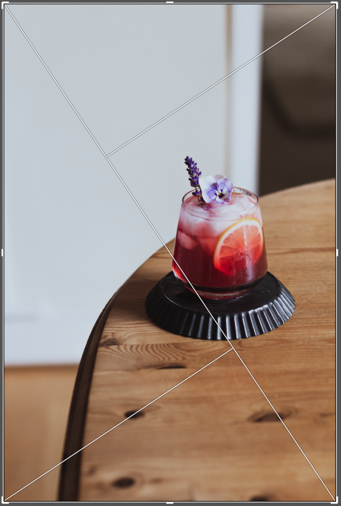
In the image above left, you can see that I positioned the drink so that the edge of the tray on which it's placed almost touches the intersection. The drink itself has a detailed garnish and is a vibrant colour, so I decided to leave all the other triangles relatively empty, except for the naturally occurring furniture in my house.
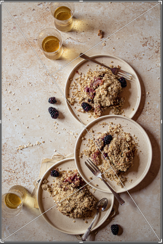
The image above right is a little busier. You can see how I've used the lines and intersections to position the three main plates and then the glasses are placed inside the top and left triangles. These two triangles were then intentionally left empty to allow the image to "breathe" and give it a light, airy feel.
Takeaway messages
Here's a short summary of what you learned in this post:
- composition grids like the golden triangle in photography are guidelines to help your learning; they are not hard and fast rules.
- the golden triangle can be used to help place your main subject either on the line intersections or in-between the intersections.
- props and supporting elements can be positioned on or along the lines, or inside the triangles to help create leading lines and guide the eye towards the hero.
- the triangles can be used to balance the image and create intentional negative space.
Boost Your Skills. Join 800+ Subscribers.
Get weekly free food photography tips delivered straight to your inbox

Hi Linda! thank you very much for this post, I’ve been looking for these tips for a long time, everything is so well explained, love it! thank you 🙂
I’m so glad this post was helpful for your Monica! Thank you so much for taking the time to read it 🙂